As patient access to test results continues to increase, it is important that these results are presented in a way that is useful for both patients and clinicians. While patients and clinicians both agree that visualizing lab test results is better than the current method of presenting test results in tables, there is new evidence that clinicians may be resistant to presenting test results in ways that make the information the most useful for patients.
Aaron Scherer, PhD, associate of Internal Medicine, was part of a team comprised of researchers from a variety of institutions, including the University of Michigan and University of Utah, that published results last year from an experiment testing different lab test visualizations of hemoglobin A1c with members of the general population and patients with diabetes testing. Scherer and his collaborators tested different designs for presenting the standard range of hemoglobin A1c, which is based on an entire population, a goal range more appropriate for patients with type 2 diabetes, and different risk categories.
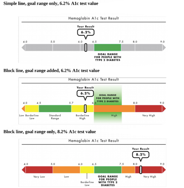
One of the key findings from last year’s study was that providing information about the goal range produced improved understanding and reduced discouragement about the test result. However, this benefit weakened, or even disappeared, with the inclusions of additional information, such as the standard range or risk categories.
Now, Scherer and the research team conducted a follow-up study, which is now published in the journal Medical Decision Making, the flagship journal for the Society for Medical Decision Making, this time with physicians. The study assessed the responses of 327 primary care physicians to a variety of visualizations of lab test results previously tested with. The key outcomes the research team cared about were the appeal and acceptability of using each design, as well as whether the physicians believed the designs would alter their workload or liability.
The survey revealed that 85–89% preferred the visual designs over tables, but 19–32% anticipated a workload increase and 32–40% expressed liability concerns with this new designs. Most relevant for Scherer’s earlier experiment, 71% of the clinicians wanted to include the goal range in addition to the standard range in test result reports to patients and 24% reported they thought it would be unacceptable to present only the goal range.
“The concerning upshot of our study is that it appears like clinicians have a strong preference for providing more information than necessary, even in situations where providing this extra information might decrease patient understanding and motivation to reach their health goals,” Scherer said.
Contributing authors on this publication include Brian Zikmund-Fisher, PhD, Health Behavior and Health Education, University of Michigan; Jacob Solomon, PhD, Athena Health; Nicole Exe, MPH, Institute for Clinical and Health Research, University of Michigan; Beth Tarini, MD, MS, Pediatrics, George Washington University School of Medicine and Health Science; Angela Fagerlin, PhD, Population Health Sciences, University of Utah; and Holly Witteman, PhD, Family & Emergency Medicine, Université Laval.