Spring conference season is in full swing, and while we’re all still attending annual professional conferences virtually, most of the same standards and guidelines for printed posters apply to e-posters.
First and foremost, if you need assistance in creating an eye-catching poster, be sure to enlist the services of our talented Design Center graphic designers, Ann Armstrong and Teresa Ruggle. Many of you have picked up fabric or paper posters from the Design Center over the years, but our design team applies the same keen eye to e-poster design. If you’re looking for a poster template to avoid spending time on “design,” the Design Center has those too, available here.
But the main focus of this post is to review poster content, from an editor’s perspective. Most of these tips are also available on our newly designed page Creating Effective Posters. Expand the accordion FAQs depending on your concern or view the short video presentation at the bottom of the page.
When editing poster content, I usually spend most of my efforts on reducing the amount of text. It’s tempting for a lot of authors to include as many details of their study or project as possible: step-by-step methods, numerous tables presenting every scrap of data, or long discussions of their study implications. However, it’s vital to keep in mind that a poster is not a manuscript. Hopefully you’ll eventually write up your project and submit for publication, but for the poster, it’s always best to stick to the highlights:
- present the main one or two results – think of these as take-home messages
- don’t include a lot of background information about your topic; only include enough to explain why you conducted your particular study – remember, your audience is already familiar with the general scope of your work
- include only an overview of your methods and save the details for the paper
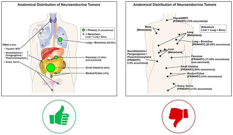
- present as much of your results as possible in graphic form – tables, charts, or images
- include a few bullet points to wrap up your work – implications of your findings and future directions
- all text on a poster should be in bullet point format; avoid paragraphs

My secondary focus when editing posters is to review author names and affiliations, to confirm spellings and proper institution names, and check that funding and disclosure information is included if required by the conference (this information usually is).
Remember: keep posters simple and to the point. Whether in person or online, viewers at any conference will only spend a few minutes skimming posters, looking for the main points before deciding whether to dig deeper or move on to the next poster. That is true whether they’re walking through a hotel conference room or clicking through a virtual space.
As always, feel free to contact me with any poster content and text questions at kristina-greiner@uiowa.edu.


